@CaptTom wrote:
I really don’t know when this started, and it’s only a minor annoyance, but I’m hoping maybe there’s an obvious fix…
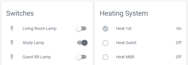
In Lovelace, all the little icons next to the entries, and the slider bars for switches, are grayed out. They used to be blue when “on” or “true.” Here’s an example:
In this example, “Study Lamp” and “Heat 1st” are both “On.” The slider, the lightning bolt icon and the check mark (tick mark) icon used to be colored blue in this state.
I’ve not really played much with Lovelace. I tried the Backend-selected theme, default theme, and Clear theme. I’ve never changed the themes or CSS. I’ve done a browser refresh many times.
Posts: 6
Participants: 2
